Every engineering team reaches a breaking point where UI development slows to a crawl. You start to notice identical button components implemented five different ways, inconsistencies in form validation behaviours, and CSS specificity battles that require !important flags just to patch a layout block. These symptoms aren’t merely cosmetic flaws; they are concrete engineering bottlenecks stemming from a lack of a unified technical foundation. As systems expand, understanding the impact of frontend architecture on modern web applications becomes vital to preserving delivery speed and long-term codebase health.
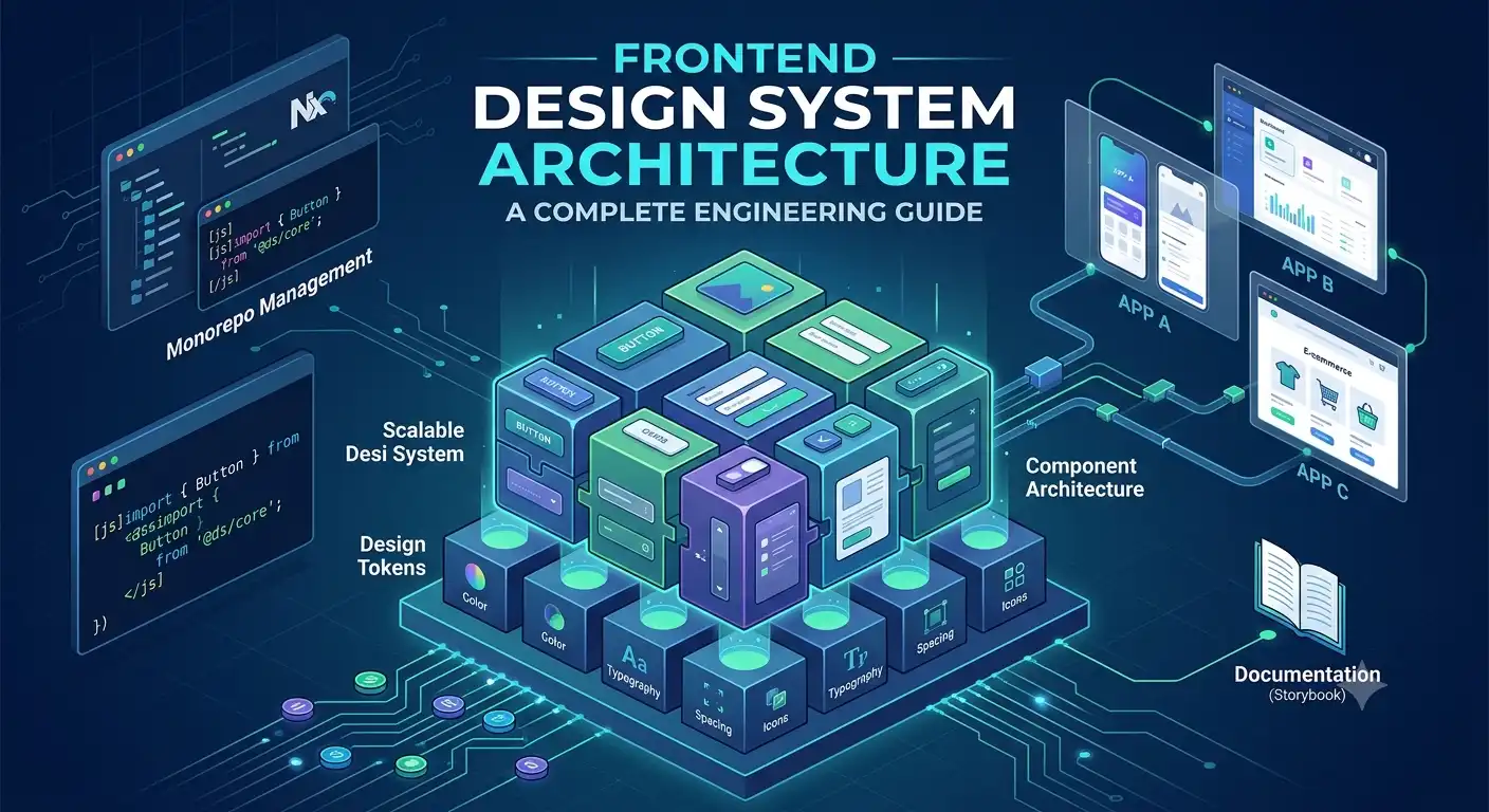
Building a production-ready system requires looking past simple UI component kits. A true frontend design system architecture functions as a highly scalable, multi-layered technical platform. It establishes programmatic data streams for design decisions, isolates visual presentation from raw engine logic, and defines predictable distribution mechanisms for independent consumer applications. This guide breaks down the core architectural patterns required to design, construct, and scale a bulletproof design system platform capable of supporting distributed engineering organisations in 2026.
1. Foundational Pillar: Multi-Tiered Design Tokens
At the base of any robust design system architecture lies the design token pipeline. Design tokens are the atomic elements of a visual brand: colours, typography rules, spacing intervals, animations, and depth metrics—stored as clean, platform-agnostic data structures. Instead of hardcoding hex values or raw pixel dimensions inside your component scripts, your systems must treat styling constants as a compile-time dependency graph.
The Three-Tier Token Architecture
To prevent token bloat and maintain long-term maintainability, use a strict three-tiered token organisation strategy:
- Global Tokens (Tier 1): The raw options of your visual identity. These are absolute values that define the brand palette or type scale, completely independent of context (e.g.,
color-blue-500: #0070f3). - Semantic Tokens (Tier 2): Tokens that map a generic Global option to a specific functional role or intent within the user interface. These tokens change their underlying reference based on the active mode, such as light or dark themes (e.g.,
color-background-action: color-blue-500). - Component Tokens (Tier 3): Highly specific, scoped definitions linked directly to individual structural variants. They reference Semantic tokens to protect the core design system from systemic breakages when an individual component requires granular visual tuning (e.g.,
button-primary-bg: color-background-action).
Automating the Engine with Style Dictionary
Design tokens should never be hand-maintained across separate files or format definitions. Instead, author your design decisions in a single JSON or W3C Design Token format source, then run them through an automated compilation engine like Amazon’s Style Dictionary. This setup converts raw token files into platform-native outputs like CSS Custom Properties, Tailwind configuration files, JavaScript object maps, or iOS Swift dictionaries.
Below is a production-grade configuration file for a design token transformation pipeline:
// style-dictionary.config.js
module.exports = {
  source: ['tokens/**/*.json'],
  platforms: {
    scss: {
      transformGroup: 'scss',
      buildPath: 'dist/scss/',
      files: [{
        destination: '_tokens.scss',
        format: 'scss/variables'
      }]
    },
    css: {
      transformGroup: 'css',
      buildPath: 'dist/css/',
      files: [{
        destination: 'tokens.css',
        format: 'css/variables',
        options: {
          selector: ':root'
        }
      }]
    },
    js: {
      transformGroup: 'js',
      buildPath: 'dist/js/',
      files: [{
        destination: 'tokens.esm.js',
        format: 'javascript/es6'
      }]
    }
  }
};
By automating this transformation step, visual styles can update centrally at the design layer and flow programmatically into your builds without manual developer intervention.
2. Design System Component Architecture: Headless vs. Styled
When engineering a design system component architecture, a common structural trap is baking rigid visual styling directly into core component behaviour. This approach locks your code into a single visual style, making it difficult to refactor components when your product line changes or scales. To build components that last, separate interactive state management from final structural styling.
The Power of Headless Primitives
Headless UI primitives provide full functional control—handling keyboard navigation loops, focus traps, screen reader accessibility attributes, and internal state engines—while leaving the layout engine unstyled. By anchoring your architecture on top of battle-tested headless libraries like Radix Primitives, React Aria, or Zag, you inherit reliable base functionality. This frees your engineering teams to focus purely on visual styling, compliance and performance tuning.
Implementing the Compound Component Pattern
To expose intuitive interfaces to consumer applications while protecting internal design system specifications, use the compound component pattern. This approach allows components to share implicit state and collaborate under a clean, unified parent shell, providing developers with composition flexibility without leaking raw implementation details.
Here is an example of a composable, accessible dropdown menu using the compound component pattern:
import React, { createContext, useContext, useState } from 'react';

const DropdownContext = createContext(null);

export function Dropdown({ children }) {
  const [isOpen, setIsOpen] = useState(false);
  const toggle = () => setIsOpen((prev) => !prev);

  return (
    <DropdownContext.Provider value={{ isOpen, toggle }}>
      <div className="dropdown-container" style={{ position: 'relative' }}>
        {children}
      </div>
    </DropdownContext.Provider>
  );
}

export function DropdownTrigger({ children }) {
  const { toggle, isOpen } = useContext(DropdownContext);
  return (
    <button
      onClick={toggle}
      aria-haspopup="true"
      aria-expanded={isOpen}
      className="ds-button ds-button--primary"
    >
      {children}
    </button>
  );
}

export function DropdownMenu({ children }) {
  const { isOpen } = useContext(DropdownContext);
  if (!isOpen) return null;

  return (
    <div
      className="ds-dropdown-menu"
      role="menu"
      style={{ position: 'absolute', top: '100%', left: 0, zIndex: 1000 }}
    >
      {children}
    </div>
  );
}

export function DropdownItem({ children, onClick }) {
  return (
    <div
      className="ds-dropdown-item"
      role="menuitem"
      tabIndex={0}
      onClick={onClick}
      onKeyDown={(e) => e.key === 'Enter' && onClick()}
    >
      {children}
    </div>
  );
}
By splitting components into logical, cohesive sub-elements, consumer applications gain deep configuration flexibility. This architecture lets teams customize internal content structures without breaking core focus controls or accessibility baselines required by the W3C Web Content Accessibility Guidelines (WCAG).
3. Workspaces and Monorepo Infrastructure
A mature design system cannot operate as a single monolithic package. It needs to distribute specific assets—such as raw tokens, icons, core utilities, component definitions, and documentation sites—as independent npm packages. Managing these components across disjointed repositories creates integration delays, versioning mismatch issues, and testing friction.
Consolidating Assets with Modern Monorepos
Using a centralised monorepo architecture solves these collaboration issues. Housing your code within a modern workspace framework like Nx or Turborepo provides a unified environment. In this setup, dependency management remains atomic, local integration testing happens instantly, and build tasks run in parallel via remote caching engines.
When planning your system topology, ensure your monorepo splits technical concerns into isolated, focused work zones:
@ds/tokens: Compiles code-agnostic JSON definitions into multiple target runtime-style files.@ds/icons: Transforms visual SVG icons into optimised React components.@ds/core: Exposes underlying primitive modules, shared engine hooks, and common layout utilities.@ds/react: The consumer-facing component tier, styled using your central token definitions.@ds/documentation: The living style guide, interactive sandboxes, and API specifications.
When coordinating these multi-package workspaces, configuring a robust compilation engine is essential. For detailed guidance on structuring this workspace setup, explore our step-by-step tutorial on React monorepo setup with Nx. When deciding whether to manage your broader system assets as a single entity or as divided modules, review our detailed architectural comparison of monolith frontend vs micro frontend structures.
4. Performance Optimisation and Asset Delivery
An enterprise design system is used across many different applications. If your design system architecture imports massive, monolithic bundles, it will degrade page performance and hurt Web Vitals across all downstream products. Your components must remain light, highly optimised, and friendly to modern tree-shaking mechanisms.
Enabling Clean Tree-Shaking
To ensure modern build bundles can strip out unused code paths during compilation, distribute your system assets in standard ECMAScript Module (ESM) formats alongside traditional CommonJS (CJS) fallbacks. Mark your components as side-effect-free within your primary package configuration files to signal optimisation tools that unused component logic can be safely discarded.
{
"name": "@ds/react",
"version": "1.2.0",
"main": "./dist/index.cjs.js",
"module": "./dist/index.esm.js",
"types": "./dist/index.d.ts",
"sideEffects": false
}
Optimising Runtime Styling Mechanics
Using runtime CSS-in-JS engines that dynamically compute and inject styles into the document head can add significant execution overhead to the browser’s main thread. This overhead is particularly costly when rendering long, data-dense layouts like complex tables or deep interactive feeds. For predictable rendering paths, prioritise build-time compilation styles, CSS Modules, or utility CSS architectures like Tailwind.
When application views require rendering heavy, repeating UI sets, your architecture should avoid mounting the entire tree at once. Instead, defer rendering off-screen blocks until the user actually scrolls to them. Learn how to implement efficient rendering loops in our guide on React lazy rendering with Intersection Observer.
Additionally, monitoring how complex component layouts affect paint metrics prevents rendering delays. For an operational breakdown of capturing real-time rendering metrics, consult our frontend performance profiling guide. Finally, to ensure custom transitions and animation definitions execute efficiently on target devices, read our breakdown of GPU acceleration in modern browsers.
5. Continuous Integration and Quality Assurance
When hundreds of developers rely on your core component design system, a single regression bug can quickly break production layouts across dozens of application streams. To prevent these failures, your design system pipeline must run strict, automated safety checks on every code commit.
Visual Regression and Accessibility Isolation
Unit tests often miss subtle visual bugs, like an accidental padding shift or a broken layout line. To catch these visual discrepancies, integrate automated visual regression testing tools like Chromatic or Playwright Visual Comparisons directly into your merge requests. These engines capture component screenshots across various viewports and browsers, flagging pixel deviations before code enters the main branch.
Alongside visual checks, run automated accessibility evaluations using tools like @axe-core/react during continuous integration. This practice helps catch missing ARIA roles, low contrast values, or broken keyboard navigation states before they hit production.
Automating the Distribution Pipeline
A design system’s release process must be reliable, transparent, and completely decoupled from manual developer approvals. Integrating automated package tracking pipelines ensures your change histories, dependency updates, and release records stay consistent.
To learn how to configure and deploy secure, automated pipelines for package distribution, check out our implementation guide on GitLab frontend deployment automation. To ensure your build inputs follow consistent standards before starting a deployment job, read our technical blueprint on frontend code quality standards.
6. System Governance and Engineering Leadership
The hardest part of frontend engineering excellence isn’t writing the initial code—it’s managing adoption and guiding governance across separate product groups. A design system is a living platform that requires ongoing maintenance, community collaboration, and clear paths for evolutionary updates.
The Federated Governance Model
Avoid the isolated “gatekeeper” model, where a secluded central team dictates component patterns without real-world feedback. Instead, use a federated model. In this setup, a small core group maintains the infrastructure tools, while product engineers from across the organisation contribute back to the codebase via a shared inner-source model.
This cooperative approach keeps components practical, realistic, and directly aligned with actual product challenges. It ensures the design system solves real engineering friction rather than creating unnecessary procedural roadblocks.
To explore how design systems fit into modern engineering strategies, see our article on the impact of frontend architecture on modern web applications. For a deeper look at driving architectural alignment across technical organisations, read our core guide on frontend engineering excellence: a journey through professional branding and leadership.
Frequently Asked Questions
What is the difference between a UI kit and a frontend design system architecture?
A UI kit is a static collection of visual components, such as custom-designed buttons or input boxes, built for a specific framework. A frontend design system architecture is a complete engineering platform. It manages a cross-platform design token engine, separates state logic from visual styling using headless primitives, and handles multi-package distribution, automated version tracking, and performance optimisations across an entire corporate ecosystem.
How do you manage breaking changes in a scalable design system distributed across multiple applications?
Manage breaking changes through explicit semantic versioning (SemVer) using automated tracking tools like Changesets. When an API contract or component property shifts, deprecate the old property across several minor releases, document the change in an interactive Storybook workspace, and provide automated codemods to help downstream product teams migrate their code smoothly.
Why should engineering teams prefer headless UI primitives over pre-styled components when building a design system?
Headless primitives isolate complex interaction behaviour, such as custom keyboard navigation, focus management, and ARIA accessibility properties—from the visual design. This separation lets engineers build highly reusable core components that can adapt to changing visual brand identities and design requirements over time without needing to rewrite fundamental functional logic.
Conclusion and Next Steps
Designing a sustainable frontend design system architecture requires looking beyond individual UI component files. By establishing a multi-tiered design token pipeline, separating presentation from logic with headless primitives, and building on a modern monorepo framework, you create an engineering platform that scales naturally with your product lines.
Start your design system migration by running an audit on your existing applications to identify duplicate UI assets and common visual styling inconsistencies. Map out your core design tokens, and pick a single foundational component, such as a Button or an Input field, to test your new architecture. If you want to streamline your workspace configuration, read our detailed guide on React monorepo setup with Nx to build a fast, scalable environment for your UI components.